Housing Solutions for Health Equity (HSHE)
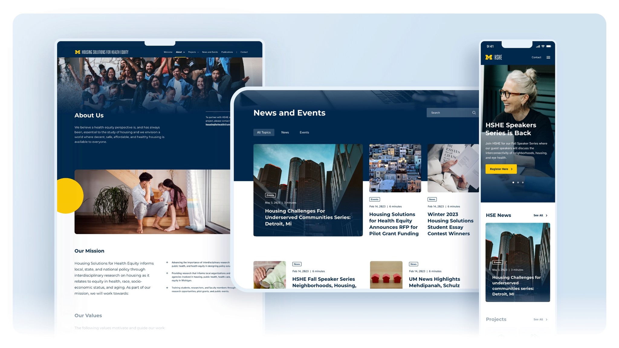
Redesigned the informational website for an initiative at the University of Michigan School of Public Health, aimed at advancing housing research and policy in Michigan.


Designed for
University of Michigan
Role and Contribution
Usability Evaluation
Information Architecture
User Interface Design
Space
Research and Social Impact
Date
October 2024
Background
How Might We
How Might We
How Might We
As a new grad student at the University of Michigan, I applied for a research assistant position with The Housing Solutions for Health Equity initiative, which promotes health equity in housing policy. The role required strong communication and visual design skills, so I went beyond my portfolio and redesigned their homepage as part of my application.
So I thought, how might we create a website for HSHE that effectively communicates its mission while offering a visually appealing and well-structured experience?
Information Architecture Inspection
Information Architecture Inspection
Information Architecture Inspection
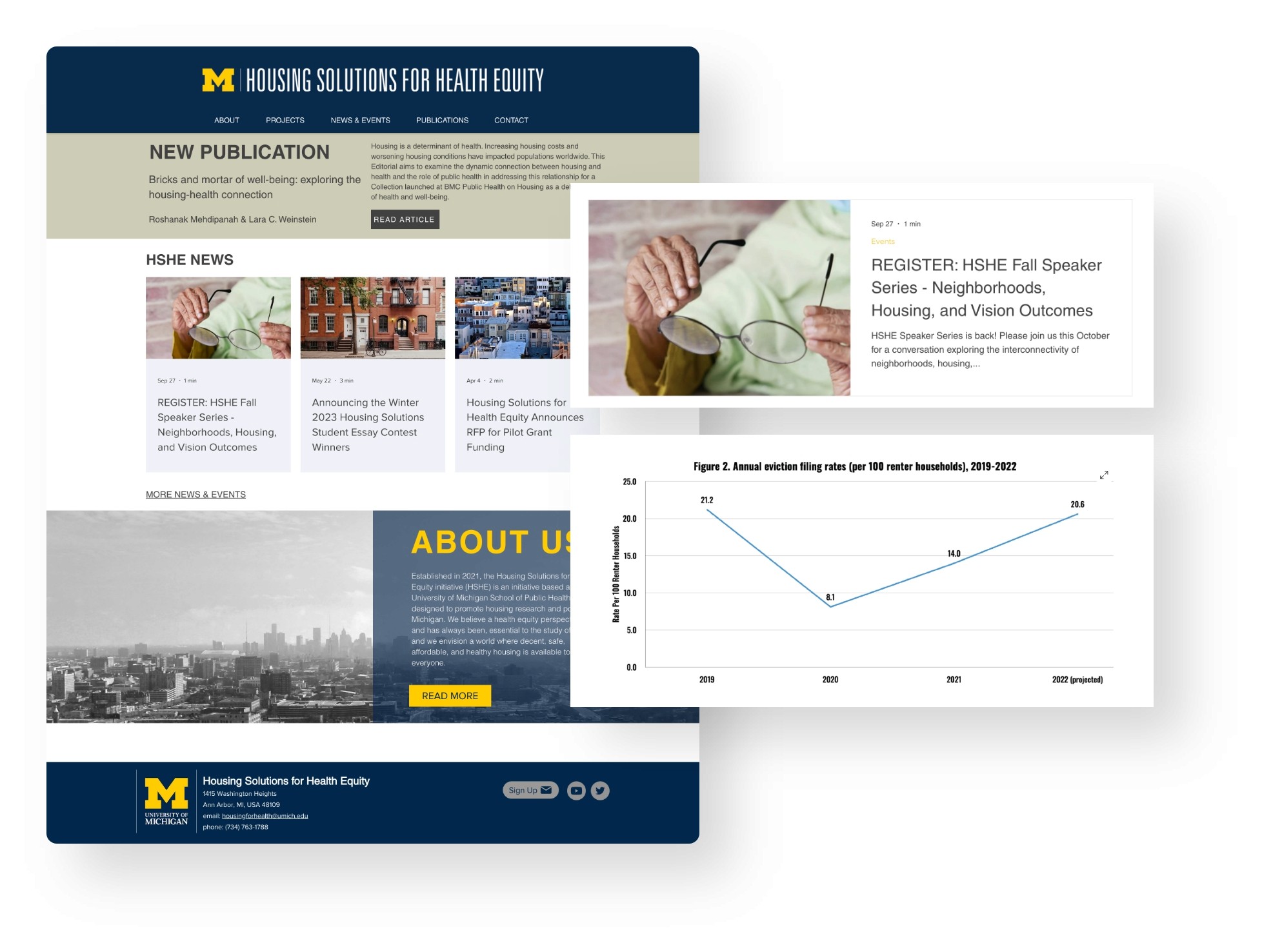
I conducted a high-level inspection to understand the sitemap and content structure.
The website serves as an informative space for the initiative, communicating research, relevant events, and blog-oriented content. Managers, and based on my understanding of communication needs in research projects, often require a robust website with a compelling proposition for effective networking and fundraising. While the current website demonstrated a reasonable level of usability on both desktop and mobile devices, I found it lacking in visual appeal and proper content highlighting.


Design Process
Heuristic Analysis
Heuristic Analysis
Heuristic Analysis
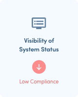
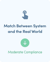
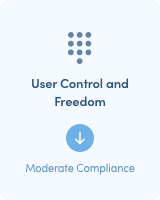
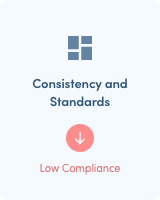
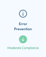
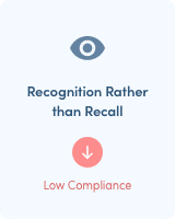
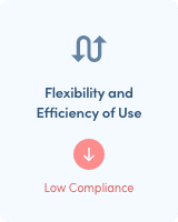
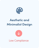
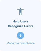
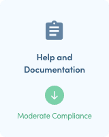
After redesigning the homepage to align with the University of Michigan brand guidelines, I received a job offer. I did not accept, but that is a story for another day. Nonetheless I was pleased with the design outcome and saw potential for a larger project. This led me to conduct a heuristic analysis of the website, aiming to identify design problems by evaluating it against a set of guidelines (heuristics) that prioritize user-friendly systems(Moran K. and Gordon K, 2023). This analysis helped pinpoint specific usability issues that can be addressed in the new design.
After redesigning the homepage to align with the University of Michigan brand guidelines, I received a job offer. I did not accept, but that is a story for another day. Nonetheless I was pleased with the design outcome and saw potential for a larger project. This led me to conduct a heuristic analysis of the website, aiming to identify design problems by evaluating it against a set of guidelines (heuristics) that prioritize user-friendly systems(Moran K. and Gordon K, 2023). This analysis helped pinpoint specific usability issues that can be addressed in the new design.
After redesigning the homepage to align with the University of Michigan brand guidelines, I received a job offer. I did not accept, but that is a story for another day. Nonetheless I was pleased with the design outcome and saw potential for a larger project. This led me to conduct a heuristic analysis of the website, aiming to identify design problems by evaluating it against a set of guidelines (heuristics) that prioritize user-friendly systems(Moran K. and Gordon K, 2023). This analysis helped pinpoint specific usability issues that can be addressed in the new design.








UI Kit
UI Kit
UI Kit
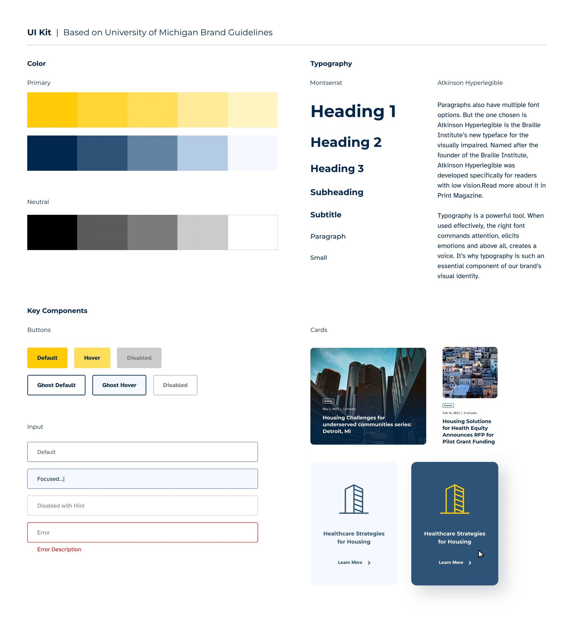
After identifying some of the issues to be resolved and before commencing the redesign, I explored several university websites to become more acquainted with the brand guidelines. This process aided in constructing a modest UI Kit, serving as the foundation for the visual design. The UI Kit included the definition of typographical hierarchy, the core color scheme, and contrast guidelines.
After identifying some of the issues to be resolved and before commencing the redesign, I explored several university websites to become more acquainted with the brand guidelines. This process aided in constructing a modest UI Kit, serving as the foundation for the visual design. The UI Kit included the definition of typographical hierarchy, the core color scheme, and contrast guidelines.
After identifying some of the issues to be resolved and before commencing the redesign, I explored several university websites to become more acquainted with the brand guidelines. This process aided in constructing a modest UI Kit, serving as the foundation for the visual design. The UI Kit included the definition of typographical hierarchy, the core color scheme, and contrast guidelines.


Responsiveness and
High-fidelity Prototype
Responsiveness and
High-fidelity Prototype
Responsiveness and
High-fidelity Prototype
The subsequent step involved determining columns and breakpoints to ensure the website's full responsiveness. This entailed considering a minimal desktop/laptop resolution of 1366 px x 768 px with 12 columns for proper display on smaller computer screens, 768 px x 1024 px with 8 columns for tablets, and 375 px x 812 px with 4 columns for mobile phones.
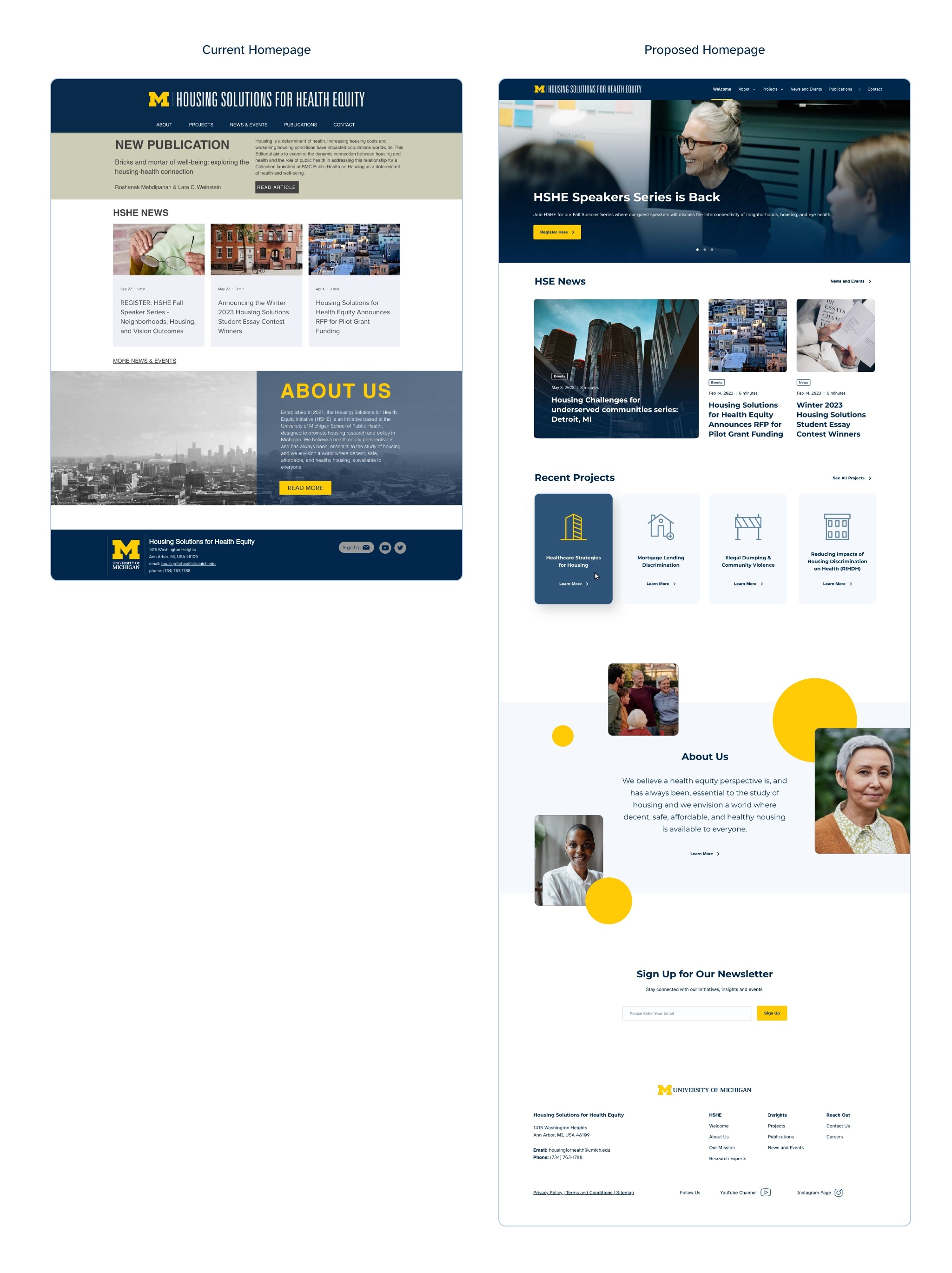
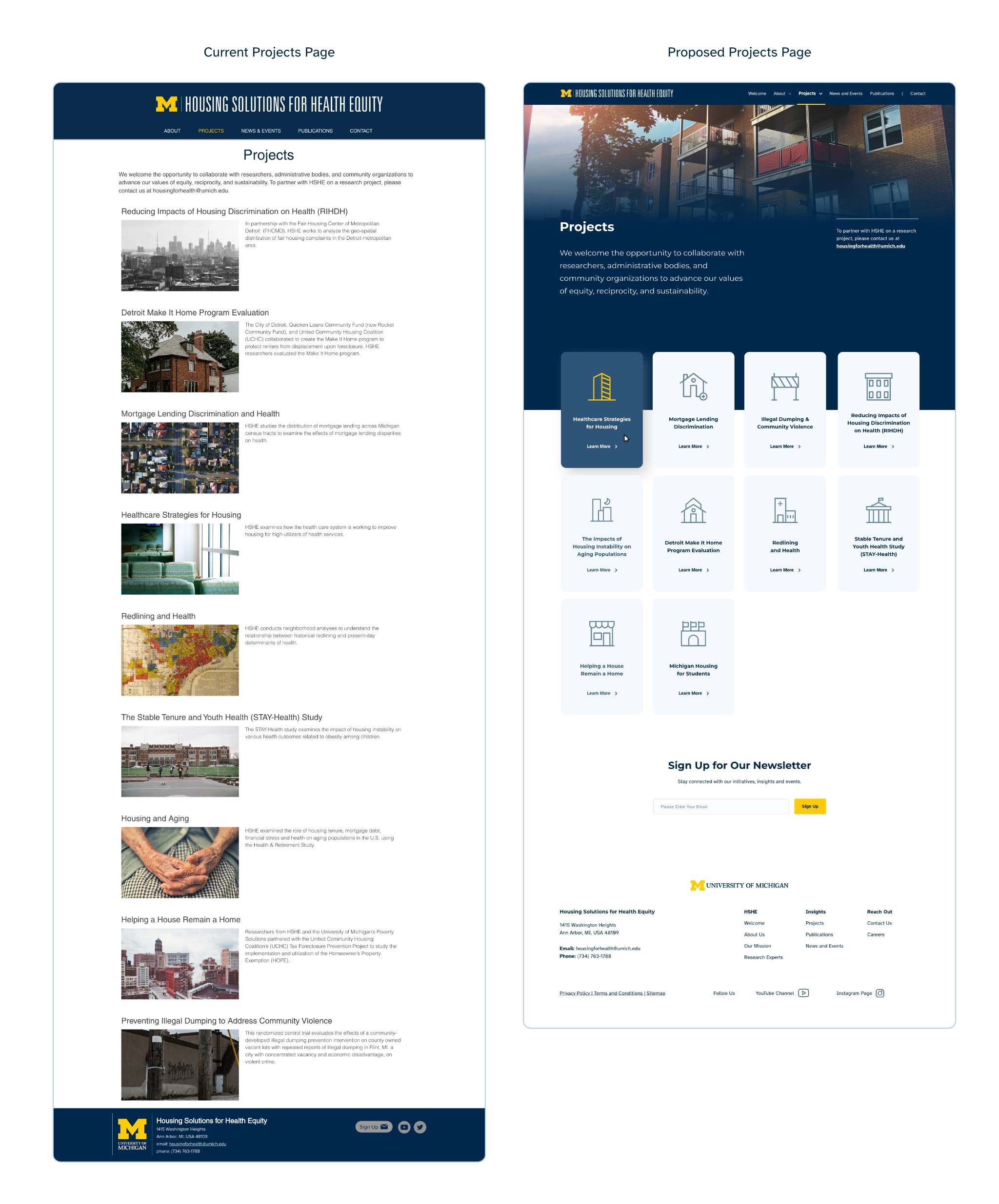
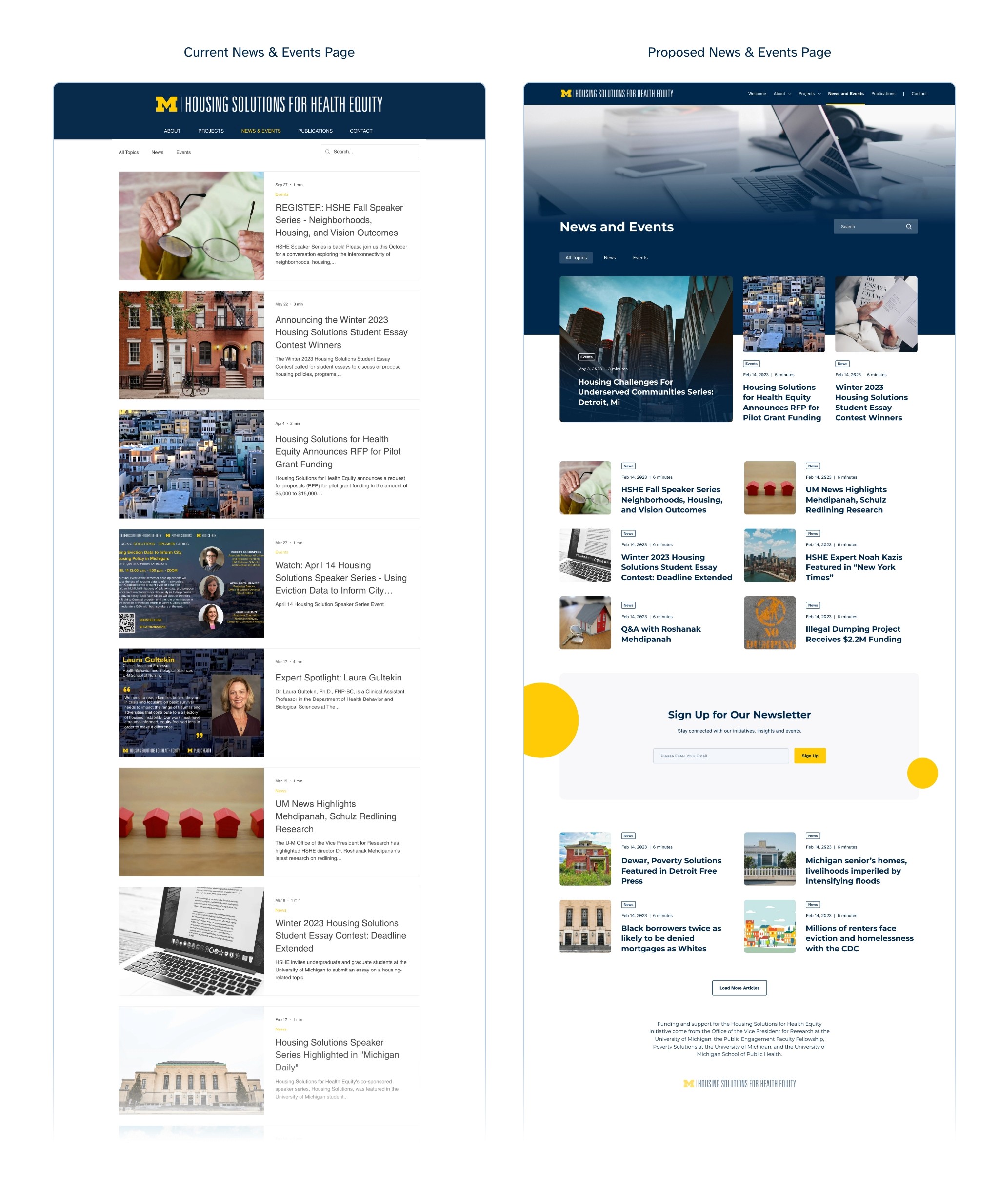
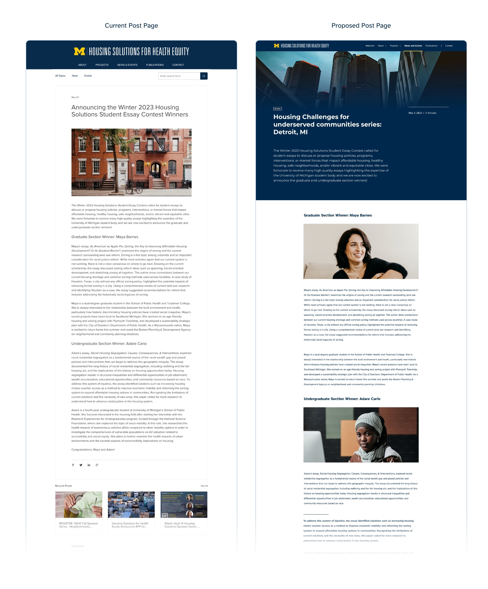
Following this, the redesign focused on creating a new look and feel that wouldn't impact the current content proposal but instead concentrated on addressing key usability issues identified in the heuristic analysis. I believe that a more profound restructuring would necessitate additional input from HSHE stakeholders and users. At this stage, I initiated a basic wireframe session to lay out the main content distribution and transitioned to high-fidelity prototyping immediately afterward.








Retrospective
How We Solved the Problem
How We Solved the Problem
How We Solved the Problem
The redesigned website now has a stronger presence, improved consistency, and better use of visuals and photography, aligning with UM’s brand and enhancing its impact on donors and stakeholders. I addressed usability issues using heuristic analysis, UM brand guidelines, and authentic photography to create a cohesive, human-centered design that aligns with the initiative’s mission.
The redesigned website now has a stronger presence, improved consistency, and better use of visuals and photography, aligning with UM’s brand and enhancing its impact on donors and stakeholders. I addressed usability issues using heuristic analysis, UM brand guidelines, and authentic photography to create a cohesive, human-centered design that aligns with the initiative’s mission.
The redesigned website now has a stronger presence, improved consistency, and better use of visuals and photography, aligning with UM’s brand and enhancing its impact on donors and stakeholders. I addressed usability issues using heuristic analysis, UM brand guidelines, and authentic photography to create a cohesive, human-centered design that aligns with the initiative’s mission.
Challenges
Challenges
Challenges
Limited time restricted my access to audience input, and sourcing authentic photography was difficult. While animations were planned, the design remains a stable MVP that addresses core usability issues and can be implemented immediately.
Limited time restricted my access to audience input, and sourcing authentic photography was difficult. While animations were planned, the design remains a stable MVP that addresses core usability issues and can be implemented immediately.
Limited time restricted my access to audience input, and sourcing authentic photography was difficult. While animations were planned, the design remains a stable MVP that addresses core usability issues and can be implemented immediately.
Learnings
Learnings
Learnings
The biggest lesson is that great initiatives often need help spreading their message, and as designers, we have the communication and technical expertise to make that happen efficiently. We should all do more of this—if only for fun.
The biggest lesson is that great initiatives often need help spreading their message, and as designers, we have the communication and technical expertise to make that happen efficiently. We should all do more of this—if only for fun.
The biggest lesson is that great initiatives often need help spreading their message, and as designers, we have the communication and technical expertise to make that happen efficiently. We should all do more of this—if only for fun.